Navigation
Install the app
How to install the app on iOS
Follow along with the video below to see how to install our site as a web app on your home screen.
Note: This feature may not be available in some browsers.
More options
You are using an out of date browser. It may not display this or other websites correctly.
You should upgrade or use an alternative browser.
You should upgrade or use an alternative browser.
Please for the love of god.....can i go back
- Thread starter SomeGuy133
- Start date
- Status
- Not open for further replies.
hardly many people have already posted saying the design lacks basic understanding of UI design.
LOL. Good lord, melodrama much? You have been here a year, the board has had more than one transition, they have always been net positive. Hell this one loads so much faster I am already sold on it. The looks? Looks fine. Functions better.
I guess you should back up the "lacks basic understanding of UI design" with your UI design creds.
michalrz
Supreme [H]ardness
- Joined
- Jun 4, 2012
- Messages
- 4,376
I think it's okay. I believe it comes down to:
- trying out smaller margins around individual elements
- more width for the "latest post" box to the right of each thread title
I can only speak for what I see regularly which is the forum
- trying out smaller margins around individual elements
- more width for the "latest post" box to the right of each thread title
I can only speak for what I see regularly which is the forum
michalrz
Supreme [H]ardness
- Joined
- Jun 4, 2012
- Messages
- 4,376
It may appear chaotic at first but do note there's just more info and certain actions are distributed to always be nearby a cursor or finger.
One thing I don't like layout wise is that those 'actions' buttons under posts (edit, del, report) are thick black and combined with the thick white font stand out. I'd try a softer look, dark gray background, or a gray font.
edit: the popups tied to the big menu buttons are iffy on ff 44.0.2 (they sometimes stay on)
SomeGuy133
2[H]4U
- Joined
- Apr 12, 2015
- Messages
- 3,447
the issues have been stated. proper design knows what things need to stick out more than others and what things are click the most and placing them in the right spots. this all goes back to concepts created by Frederick Winslow Taylor...granted reapplied to computers UI. Its all about redicing movement and making sure things are done quickly and efficiently. I should have to analyze thread to tell them apart. Tell a read vs an unread thread should require me to actual look at it. I should be able to figure it out at a glance.LOL. Good lord, melodrama much? You have been here a year, the board has had more than one transition, they have always been net positive. Hell this one loads so much faster I am already sold on it. The looks? Looks fine. Functions better.
I guess you should back up the "lacks basic understanding of UI design" with your UI design creds.
Demon10000
Supreme [H]ardness
- Joined
- Aug 20, 2006
- Messages
- 4,502
Thanks for the update. So far, I've enjoyed everything, especially the loading speed. Feels faster to me...
I did stumble around for a bit trying to figure out how to tell if a thread had new messages in it... then I realized I wasn't logged in. PROBLEM SOLVED.
I did stumble around for a bit trying to figure out how to tell if a thread had new messages in it... then I realized I wasn't logged in. PROBLEM SOLVED.
Oh the typical shortsightedness of the crowd when change happens.
HF ran on vastly unsupported, old code. The transition to Xenforo as new platform was the next natural step to take, stagnation is bad, kids. I know change is scary, but I promise you'll all get used to the new look, so for the love of everything that's decent, quit your bitching.
Shortsightedness? LOL! We are talking about visual and functional deficiencies and those are valid concerns. UI "stagnation" is not a thing. If something works, it works. Change for the sake of change or, even worse, "modernization", is stupid. Now, if the backend software needed to be updated, ok, but it doesn't mean everything else is an improvement. I can get used to the new UI just like I would get used to taking it up the ass, but I don't like it and it hasn't benefited me in new Windows and it hasn't on most web pages either. Worse visual cues, less visible content, fewer features and a fuckton more scrolling needed are not a sensical step to make and most certainly not an improvement.
deathhorse
[H]ard|Gawd
- Joined
- Nov 29, 2010
- Messages
- 1,710
Haha my eyes are way bad the site looks great. LOL like everything is big love it ") also alerts are awesome and the little new tag is a nice touch. Go Kyle!!! team {H}
also alerts are awesome and the little new tag is a nice touch. Go Kyle!!! team {H}
Also sorry to hear your troubles someguy
also alerts are awesome and the little new tag is a nice touch. Go Kyle!!! team {H}Also sorry to hear your troubles someguy
M76
[H]F Junkie
- Joined
- Jun 12, 2012
- Messages
- 14,099
Now the fonts in italic are borderline unreadable, basically all quotes.
It all just melts into one jumbled blur. Grey letters on a grey background also not the best idea.
This seems to me like a case of "don't try to fix it if it ain't broke"
Nah the more I look at it the more I think that this font NEEDS TO GO
It all just melts into one jumbled blur. Grey letters on a grey background also not the best idea.
This seems to me like a case of "don't try to fix it if it ain't broke"
Nah the more I look at it the more I think that this font NEEDS TO GO
firas
2[H]4U
- Joined
- Oct 29, 2006
- Messages
- 2,458
test
edit: anyone having the green blinking dots everywhere?
edit 2: it was everywhere not just [H], fixed it (loose cable)
edit: anyone having the green blinking dots everywhere?
edit 2: it was everywhere not just [H], fixed it (loose cable)
Last edited:
GotNoRice
[H]F Junkie
- Joined
- Jul 11, 2001
- Messages
- 12,052
I am NOT a fan of ZenForo, but so far it seems like this transition has been handled better than on most other forums.
The biggest issue that I'm having right now is the lag. I get lag even just when typing text. I will type and for a few seconds nothing will show up and then BAM it's all there. I'm also getting lag when loading pages many times, usually where half the page will load, then about 3-5 seconds later the rest of the page will load.
The biggest issue that I'm having right now is the lag. I get lag even just when typing text. I will type and for a few seconds nothing will show up and then BAM it's all there. I'm also getting lag when loading pages many times, usually where half the page will load, then about 3-5 seconds later the rest of the page will load.
SomeGuy133
2[H]4U
- Joined
- Apr 12, 2015
- Messages
- 3,447
thasta computer issue.I am NOT a fan of ZenForo, but so far it seems like this transition has been handled better than on most other forums.
The biggest issue that I'm having right now is the lag. I get lag even just when typing text. I will type and for a few seconds nothing will show up and then BAM it's all there. I'm also getting lag when loading pages many times, usually where half the page will load, then about 3-5 seconds later the rest of the page will load.
Geforcepat
[H]ard|Gawd
- Joined
- Jun 2, 2012
- Messages
- 1,186
Boy talk about a shock to the system but overall i think i like the "new" look. what i really dig is the like button man i've been wanting a like button for years. so this is great overall.
Would like more emojiis/faces
but overall i think i like the "new" look. what i really dig is the like button man i've been wanting a like button for years. so this is great overall.Would like more emojiis/faces
Last edited:
GotNoRice
[H]F Junkie
- Joined
- Jul 11, 2001
- Messages
- 12,052
thasta computer issue.
Well I have a dozen or more forums that I visit throughout the course of the day, the majority of which use XenForo, but this is the only forum having this issue.
Geforcepat
[H]ard|Gawd
- Joined
- Jun 2, 2012
- Messages
- 1,186
Your two dollas? man all you needed was 2 cents. no worries though i'll keep the change.I love hardforum.com , but don't like this new layout , looks kindergaten-ish or for the handicapped, missing that pro feeling , just my 2$
RPGWiZaRD
[H]ard|Gawd
- Joined
- Jan 24, 2009
- Messages
- 1,217
The main reason I do not like this new look is because of the poor readability, too large everything, in the old I could scroll up and down in a forum section and had this 100% feel of readability and instantly grasped its content very quickly, you quickly laid your eyes on the topic you found interesting. Now it feels a bit of a mess to browse through. Need smaller / more compact thread topics sections and better contrast to make it easier readable / quickly graspable of its content. The fact that I can only fit like 3-4 forum post on my monitor feels quite some step back too. It's simply went too much backwards in terms of readability, the faster and with less effort I can read a forum the better, I'm very limited with time and only use forum reading as breaks for my other more important hobbies so time is precious.
Last edited:
michalrz
Supreme [H]ardness
- Joined
- Jun 4, 2012
- Messages
- 4,376
Larger pagination button areas with little margin but +padding
SomeGuy133
2[H]4U
- Joined
- Apr 12, 2015
- Messages
- 3,447
I think they were Zimbabwe dollars...i didnt think it had that much valueYour two dollas? man all you needed was 2 cents. no worries though i'll keep the change.
.Yes the enlarged font is a bit much. There should be a smaller font version we can select besides white and dark. Also all thread titles look the same read unread new not new there needs to be some middle ground there. Colors and everything are fine it's just damn large and even more annoying is the fact all threads look like they are new.
- Joined
- May 18, 1997
- Messages
- 55,727
Then do it.Everything is too large, harder to read, and the guy above is spot on we took a pro look for enthusiasts and made it a soft look for casuals.
This UI makes me want to put my PC on eBay and buy a Xbox
- Joined
- May 18, 1997
- Messages
- 55,727
Scaling in your browser should get you exactly what you want.Yes the enlarged font is a bit much. There should be a smaller font version we can select besides white and dark. Also all thread titles look the same read unread new not new there needs to be some middle ground there. Colors and everything are fine it's just damn large and even more annoying is the fact all threads look like they are new.
Ok that helps with the font size not sure if it will revert back after browser close or not. I do notice that it changes the shade by one degree or something after viewing a thread but it's not alot. It also doesn't show if you just hit the back button which is why I didn't notice it before. You have to refresh the page after hitting the back button to notice threads you have gone to. All in all I like the look it's just hard to distinguish between viewed threads. Although I haven't spent much time at all on the new design. I still think a color change is in order or font size change for viewed threads. Right now it's too subtle.
STrAYeR
Limp Gawd
- Joined
- Jan 31, 2005
- Messages
- 439
I actually love the new forum look. Hope it stays. Great font and design. Good work.
firas
2[H]4U
- Joined
- Oct 29, 2006
- Messages
- 2,458
same here (didn't try it on mobile)I actually love the new forum look. Hope it stays. Great font and design. Good work.
edit: I have an avatar
horrorshow
Lakewood Original
- Joined
- Dec 14, 2007
- Messages
- 9,462
Kyle,
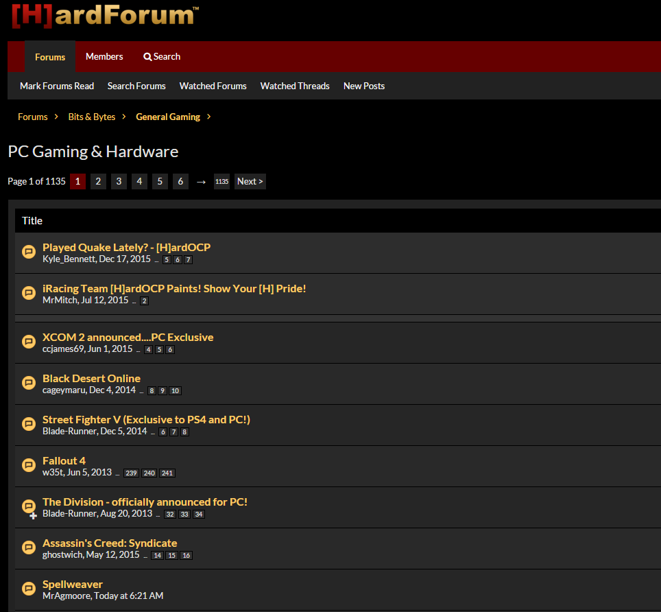
Small suggestion, not sure if it's doable with this forum. It'd be nice to see the page counts/links for each thread all the time, instead of only when hovering over a thread.
For example, I'd like to know (without hovering) that the Quake thread you started in the PC Gaming & Hardware subforum is 7 pages long.
Mockup:
CSS:
Code:span.itemPageNav { visibility: visible !important; }
This please!
Also, the "new" mark is now on the right, requiring constant left-right focus shifting while browsing. Before it was in the upper left and fell into view and attention more naturally. Easy read/unread tracking while logged out is no longer available and was very useful.
Disposed
Supreme [H]ardness
- Joined
- Mar 2, 2010
- Messages
- 5,211
I like the layout and design but so much pointlessly wasted space is what i immediately notice. I grabbed a post and highlighted all the wasted unused space. Looks like nearly 2/3 of a post like this is just empty space and thats at 1080, i cant even imagine 1440 or 4k. Looks like a mobile theme was just stretched out. Otherwise its pretty killer.

SomeGuy133
2[H]4U
- Joined
- Apr 12, 2015
- Messages
- 3,447
how is this? I like the names on the side because its easier to tell who posted than the prior version which is a plus and this saved a lot of space and keeps the nice sectioning.
See post #167. Thast what i used and i am on 4K BTW so thats why its so long. I would also move the reply stuff to the left but you get the point
See post #167. Thast what i used and i am on 4K BTW so thats why its so long. I would also move the reply stuff to the left but you get the point
Attachments
sirmonkey1985
[H]ard|DCer of the Month - July 2010
- Joined
- Sep 13, 2008
- Messages
- 22,414
font is really nice but only at high DP. other wise there is so much AA that its blurry as well.
now that i think about it, i think you're right, i was trying to figure out why the text seemed so blurry to me.. i mean i know i'm slowly going blind anyways but yeah that makes sense, lol.
SomeGuy133
2[H]4U
- Joined
- Apr 12, 2015
- Messages
- 3,447
if you take a screen shot and go in paint and zoom in you can tell that there is tons of AA and that is why it so blurry but smooth. If you zoom in you can tell the font is super nice looking but only ridiculously huge. Its a nice font if i had 8K screen :/now that i think about it, i think you're right, i was trying to figure out why the text seemed so blurry to me.. i mean i know i'm slowly going blind anyways but yeah that makes sense, lol.
PornoSatan
2[H]4U
- Joined
- Sep 3, 2004
- Messages
- 3,493
There is tons and tons of wasted space in a desktop environment, but it looks much better in a mobile environment than before. One of the reasons I liked this forum was because it held the same layout as for as long as I can remember, nice and plain and simple. This new layout on the desktop environment is going to take some getting used to. Although it would be interesting to know, is the mobile traffic what is driving this layout Kyle? Are you getting more mobile traffic than you are getting desktop traffic these days?
Last edited:
it's mostly a nice upgrade but there are some things which aren't as good as before......posting is easy and simple but doing some other things aren't as user friendly...search returns (ex- on my own posts) aren't presented in a good way and it's hard to tell which of my posts were updated since I last visited...it just shows up as a list...the 'New Posts' button doesn't seem to update as fast as before...navigating is general seems more annoying
- Status
- Not open for further replies.