Axman
VP of Extreme Liberty
- Joined
- Jul 13, 2005
- Messages
- 17,327
Well we can rule that out then.
Follow along with the video below to see how to install our site as a web app on your home screen.
Note: This feature may not be available in some browsers.
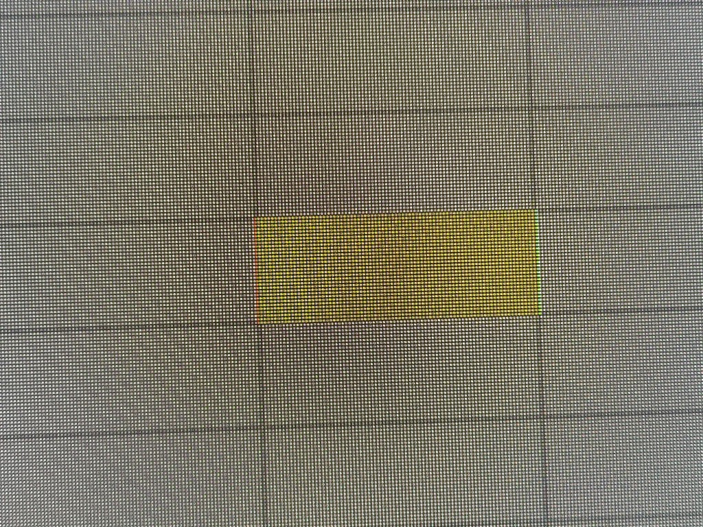
I have a 55" LG G2 TV, which I use for watching movies and also as a PC monitor.
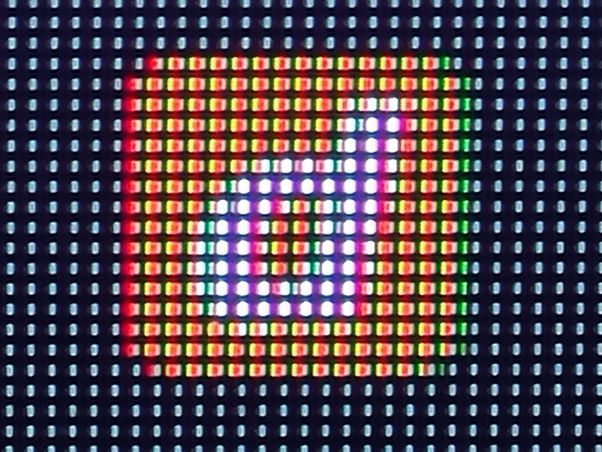
The problem with the yellow/orange/lime colored objects is very obvious and highly disturbing in Windows 11.
For a video content it's negligible, but any static element makes it clearly visible, and depending on TV/signal settings it might be somewhat weaker or stronger, but it never disappears or gets faint enough.
The main problem is that the manufacturer (LG) obviously didn't give a sh*t about solving this issue even if the TV switches to game mode and/or the source is clearly signed as a PC. WRGB is not a new technology, and using TV as a monitor is also functioning idea, at least in the last 3-4 years. Although it is clearly a hardware based problem, a highly satisfying software/firmware solution is undoubtedly possible. There is no excuse for not solving this problem as a manufacturer (LG) and as an OS developer company (Microsoft, Apple). Considering the fact that nowadays more and more monitors appear on the market with the very same panel technology and with the same issue, I really can't understand how is it still not solved?!
I attached some examples.
Even changing the width by adding or removing subpixels would be a good solution for the somewhat larger object starting from 5-10 pixels. Or at least an option in the settings would be great, so that everybody could decide if a red-green fringe or a somewhat distorted object is a better solution.I'm sure any attempt to reduce visible fringing can only be done by either adding or taking away one of the subpixels in certain situations.
This would have the effect of either shrinking or expanding the on-screen element in question, plus the smarts required to know when and when not to do this is likely beyond the capability of the firmware and/or image processing of the panel.
Not to control the pixel layout, but to make similar tricks like Clear Type depending on the chosen display type.lol you go tell nvidia, amd and microsoft that they have to be able to control the tv/monitor's pixel layout. let us know what they say....
Simple, instead of addressing only one pixel with RWBG subpixels, addressing two pixels using WBG+R subpixels. You can think about it like shifting the whole image 1/4 pixel or one subpixel to right.I have no idea how you think a firmware is able to change the physical pixel structure of a given display. What you're saying is the "fix" has to be done at the manufacturing level. Firmware can't make red OLEDs, (or blue or green) magically become a different color.


Enabling grayscale font rendering helps with ugly discolored textLast time I read reddit suggestions to use the LG C2 42" TV as a monitor.
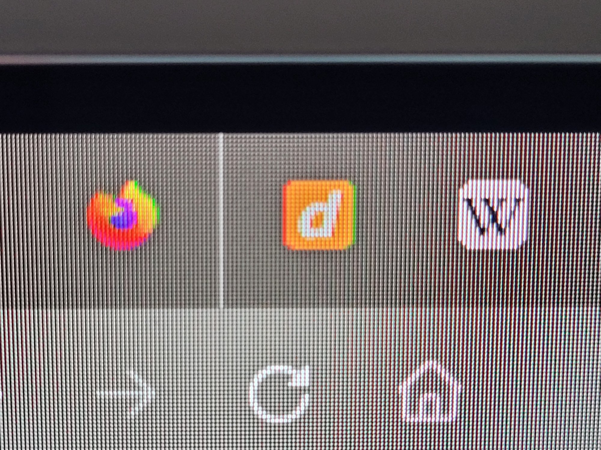
I just got this TV and immediately noticed how blurry text and ugly yellow color has an extra dash of red and green.
At least it's great for gaming or watching movies.. So I will keep it.

Reading this and I have no idea of what "feature regression" you are talking about.You may wish to upvote this possible "ClearType 2" PowerToy for custom OLED pixel structures.
https://github.com/microsoft/PowerToys/issues/25595
would require major rework of ClearType itself. While it is possible MS will do it I wouldn't bet on it."ClearType 2" PowerToy
It's an artifact of the limitation of Photoshopping it quickly -- in reality, it will be much more adjustable like the ClearType "Contrast" setting.Test image itself imho 'Special "RGB" "ClearType"' doesn't look good at all. There is red edge on left of black white part and text looks like it had slight sharpening filter on it. Grayscale looks better.
If initially incubated as third party font renderer, you can simply supersample it (e.g. render the font say, about ~16x larger in memory, and subpixel downsample). With sufficient caching of the resulting supersampler's downscample outputs, and modern GPUs, the performance should be quite more than adequate.would require major rework of ClearType itself. While it is possible MS will do it I wouldn't bet on it.
Feature regression isn't about nonstandard subpixel structure --Reading this and I have no idea of what "feature regression" you are talking about.
ClearType of old wasn't any more configurable and able to accommodate different subpixel structures in previous versions of Windows.
What are you talking about, hyst run Cleartype app and adjust monitors one after another.It's an artifact of the limitation of Photoshopping it quickly -- in reality, it will be much more adjustable like the ClearType "Contrast" setting.
ClearType vs Greyscale is also a matter of personal preference, vision differences between humans, and other factors.
So for those of you with github accounts, go ahead and upvote it anyway.
If initially incubated as third party font renderer, you can simply supersample it (e.g. render the font say, about ~16x larger in memory, and subpixel downsample). With sufficient caching of the resulting supersampler's downscample outputs, and modern GPUs, the performance should be quite more than adequate.
The algorithm is surprisingly simple GPU shader, given an appropriate subpixel texture, you run the large size glyph through it, and out comes the subpixel scaled version. There'll be some issues bypassing the TrueType/OpenType small-font hinting systems for certain tiny font sizes, but the subpixel access will tend to more than outweigh that (at least in my internal tests).
Major rework would be needed at the optimization stage, but at incubation, it's rather simple. Could easily be done initially as a reader application (like 1998's Microsoft Reader application-level ClearType support) -- so simple a future GPT4+ AI probably can almost write it already. (Just so you know, GPT4+ can already output correct small shader code samples that works in ShaderToy, upon request of simple filters like brighten-10% or pixel-merging or pixel-filter/sorting-task, etc)
That's how I kind of PhotoShopped it anyway. I also posted the generic algorithm (just today) in the other github.
And it probably will improve further if I did some spatial-correction by supersampling it via R-(blank)-G-B in quarters that is spatially-correct, rather than R-G-B in thirds that is slightly spatial-incorrect (the way I did it in a quick and dirty way). Sampling W would have been ideal, but the W is a hardware-controlled subpixel as a weighting between R+G+B with no software control, so the algorithm can only control the subpixels that software does have control over.
Feature regression isn't about nonstandard subpixel structure --
It's about RGB versus BGR.
BEFORE: In some past versions of Windows, you could configure multimonitor -- e.g. RGB on laptop/monitor and BGR on TV.
AFTER: Right now you can't. It's either RGB or BGR globally for all displays.
Subpixel structure, either standard or nonstandard, should be a per-display configuration setting.
I've edited the github to clarify this potential misunderstanding / misinterpretation;
It's a false behavior at least for Windows 10. The select-monitor doesn't work. The problem really shows up if you have a television set that uses the upside-down B-G-R.What are you talking about, hyst run Cleartype app and adjust monitors one after another.

unless it has a text mode, like my hisense does, no. its the nature of the pixel layout.Hi,
I've just bought the LG C3 42-inch TV. Excel work is a bit confusing for me. I'm not disappointed by the screen, but it feels somewhat unfinished.
We are talking about a text fringing issue, and it seems to be on a good path for improvement for Windows, as I understand.
But, is there any chance that these awful red and green lines on yellow content can be fixed in the future?
Thank you very much for your work.
Brice
They were designed for entertainment consumption, not office work.After months of staring at blurry text and color fringing on my PG42UQ I finally switched to a PG38UQ back in July. That is an IPS panel. The difference is night and day. I will never go back to an RWBG OLED panel again. Those panels were designed for televisions not computer monitors.
Coming back after using the aw3423dw for months primarily for coding, I just don't quite understand this take.After months of staring at blurry text and color fringing on my PG42UQ I finally switched to a PG38UQ back in July. That is an IPS panel. The difference is night and day. I will never go back to an RWBG OLED panel again. Those panels were designed for televisions not computer monitors.


Coming back after using the aw3423dw for months primarily for coding, I just don't quite understand this take.
Small black text on white background? Yeah I may see your point, but who uses light themes anymore for productivity? I understand it's a preference but I would have migraines all day if not for dark mode.
I use true black backgrounds with colored text and it looks great to me
I'm using HDR 1000 too, so it really pops, isn't blurry either...but I can't demonstrate that due to just how cameras have a difficult time capturing small bright light sources without glaring.
This one is even a lighter grey, seems perfectly readable without issue. there's some glaring but again, that's the camera and likely my lack of a steady hand. Also these pics are taken very up close and look much worse than how it actually is, but despite that, not bad at all.
That makes sense. I guess the QD-OLED stuff isn't just all marketingYour Alienware monitor does not use the same panel as the Asus PG42UQ. The PG42UQ uses an RWBG OLED panel. That panel should never have gone into a display that was marketed as a computer monitor. At least LG markets theirs as a television. This thread goes into great detail why the RWBG subpixel layout has problems with color fringing and blurry text.
")
Fixed pixel, high contrast, OLED should certainly not have been blurry. Maybe not pretty, but not blurry. Unless there was some connection issue or a bad screen coating or such.Your Alienware monitor does not use the same panel as the Asus PG42UQ. The PG42UQ uses an RWBG OLED panel. That panel should never have gone into a display that was marketed as a computer monitor. At least LG markets theirs as a television. This thread goes into great detail why the RWBG subpixel layout has problems with color fringing and blurry text.
Some of us are massively more bothered by it, especially with desktop use at close viewing distances, unlike televisions at further view distances.
However, there's a fix for your TV. People can fix ClearType on any BGR panel of any technology (including HiSense) via downloading Better Cleartype Tuner and switching ClearType to BGR instead of RGB.
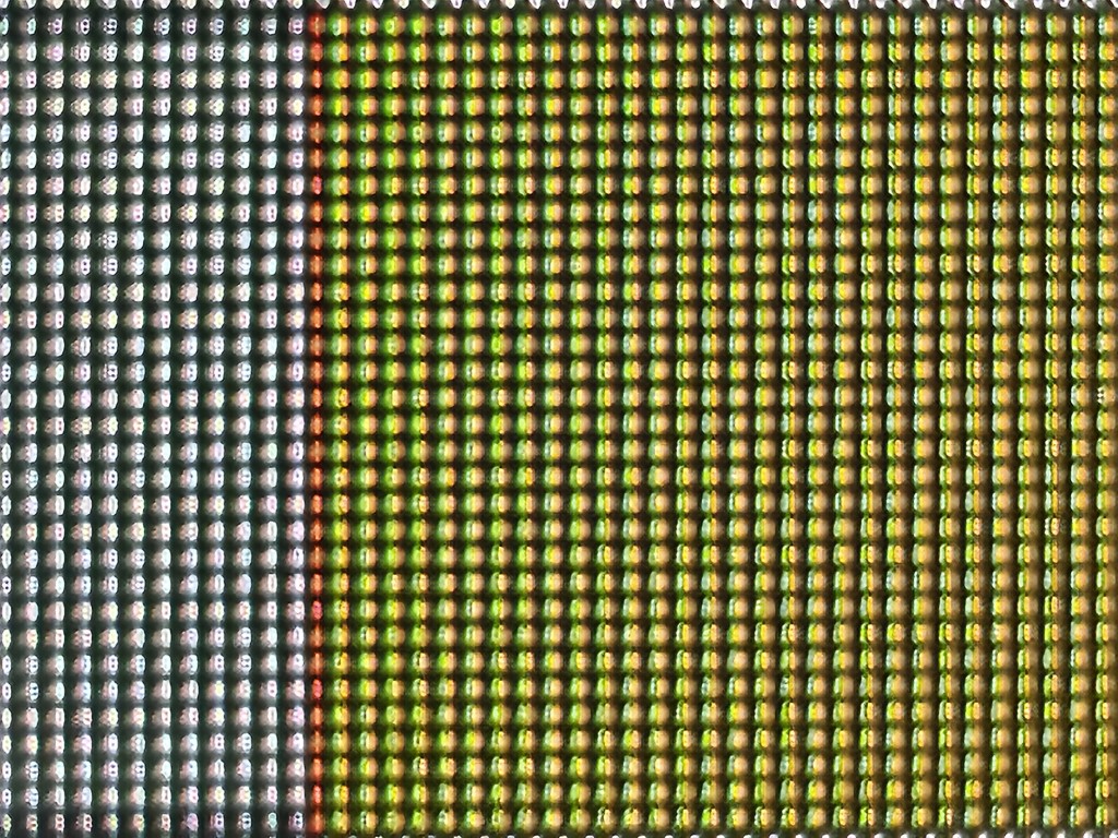
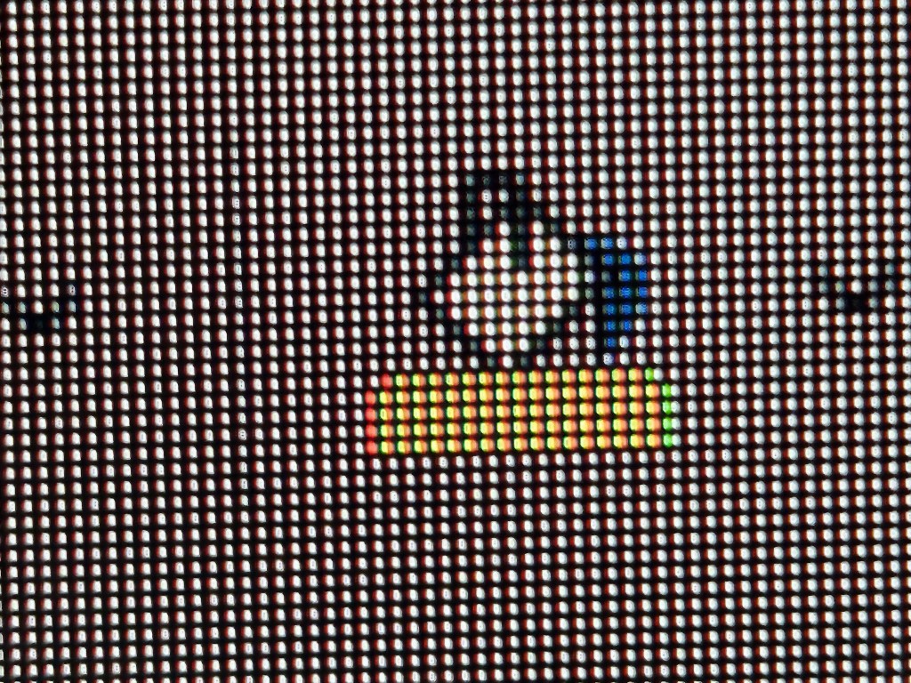
View attachment 544371
The software is great for all televisions including odd OLED and LCD pixel layouts, to make text look better.
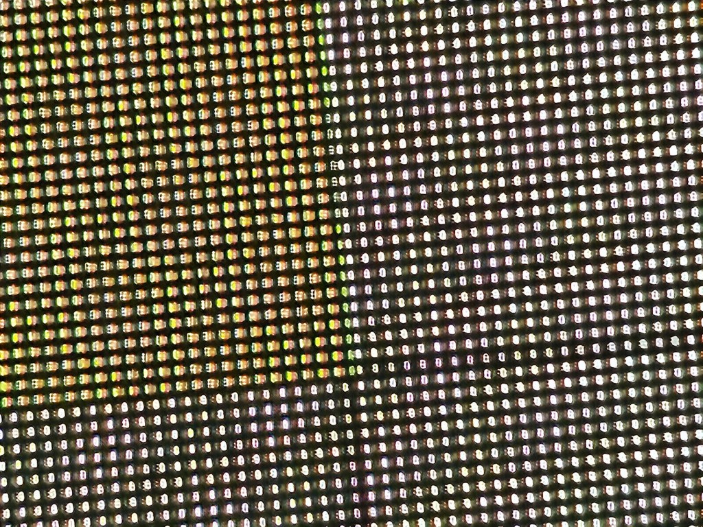
Then the HiSense television text became sharper, and looked closer to a computer monitor, much better text more comfortable at close viewing distances (like using a television as a desktop computer monitor, which I also do too sometimes). This is because many HiSense LCDs use BGR pixel layout, and ClearType has a BGR mode.
RTINGS HiSense U7G television at www.rtings.com/tv/reviews/hisense/u7g
View attachment 544370
For television-targeted panels, there are some reasons why some things are done this way -- like relocating television electronics to the bottom edge of the screen, or adjusting a pixel structure for better pixel wear balance between color channels (e.g. mitigate OLED pixel wear and tear more equally on all colors). Some LCD panels are fabricated in a way that makes it easier to design a television around BGR instead of RGB, since panel vendors and television vendors are often left-hand, right-hand. Netflix users don't really worry about computer text rendering as much, so there's been more freedom to go away from RGB on televisions.
There's lots of public papers that talk all about these pixel structure oddities for plain old fashioned video use, but it is quite true that many television manufacturers aren't really testing for computer text clarity, industry-wide. RTINGS talk about this quite a bit.
BTW, we were once using CRTs, where subpixels had no correlation to pixels...
___
Anyway, to get back to OLED color fringing topic, Better ClearType Tuner can help reduce fringing with computer text quite a bit on any OLED panel ever released. So definitely download it for your OLED to improve your text. However, this does not affect color fringing on things like yellow objects on black or white backgrounds. (Continued photography is welcome on all models and brands of OLED, I'd love to see more.)